
Go big, or go home.
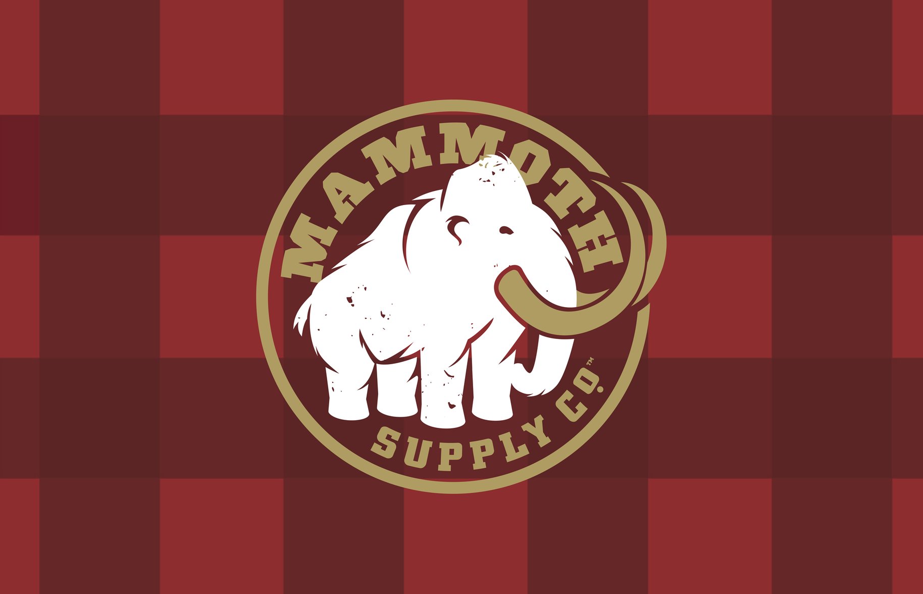
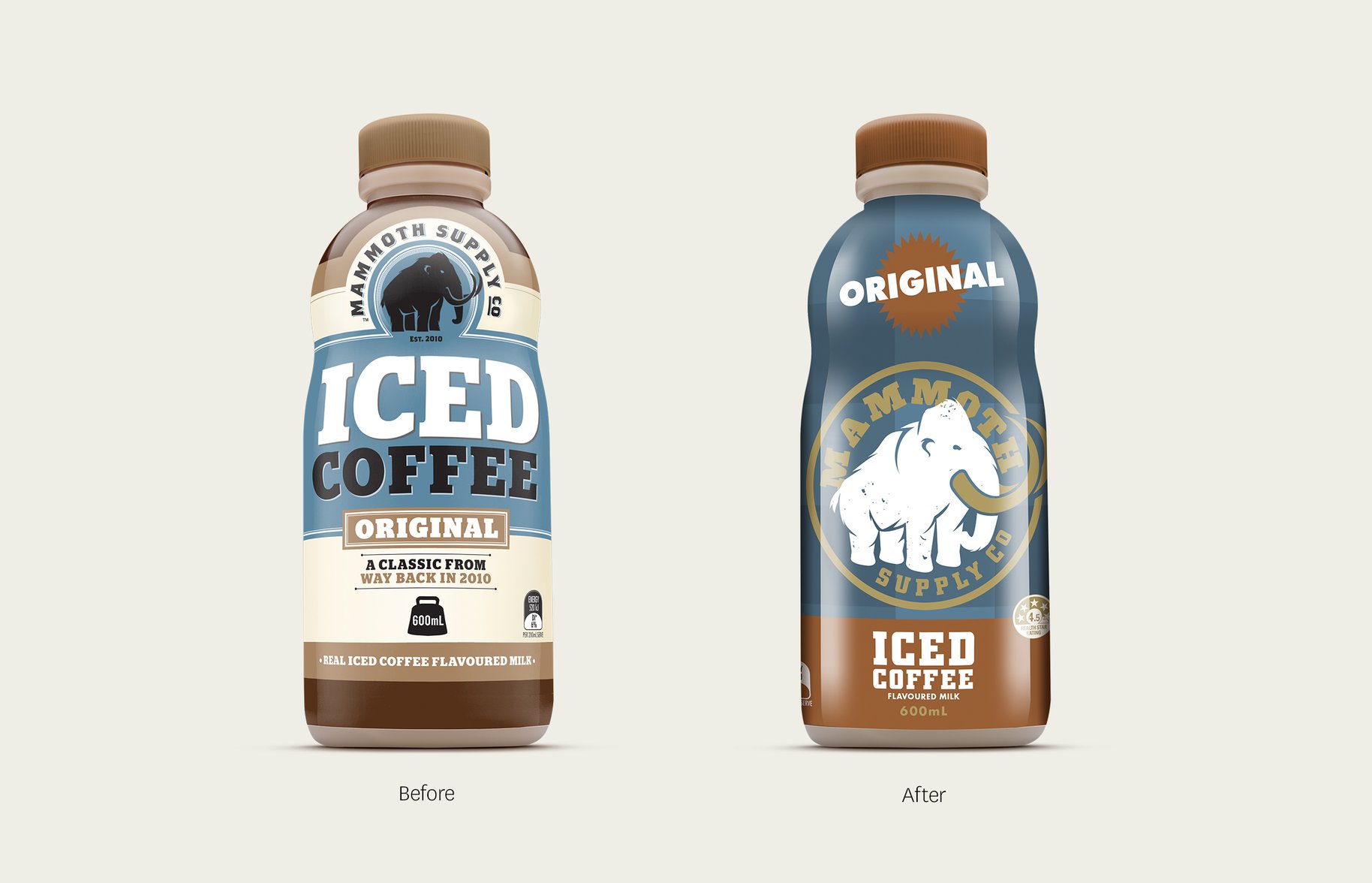
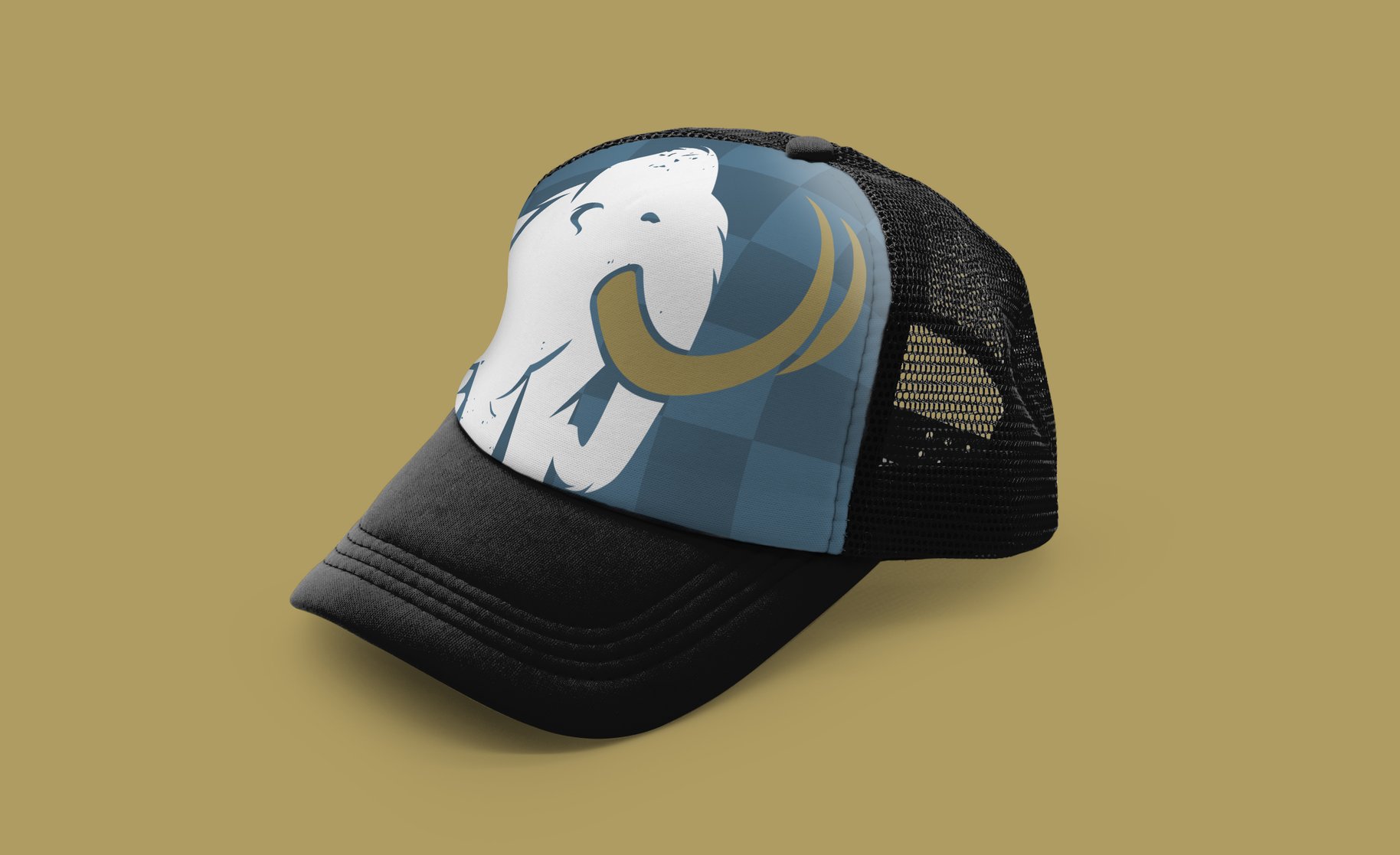
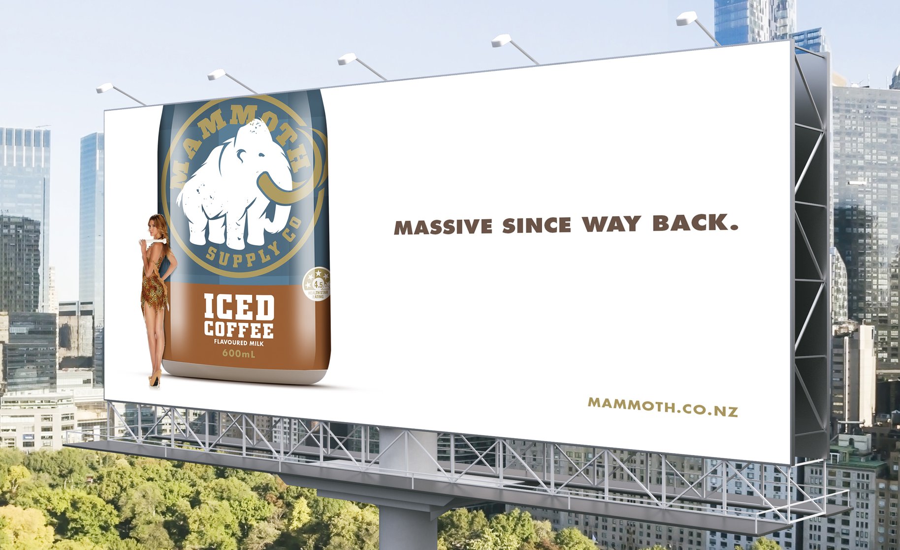
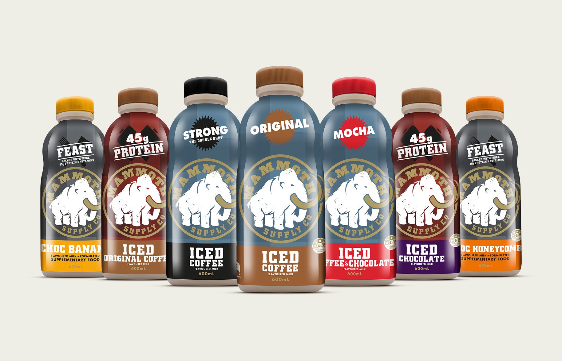
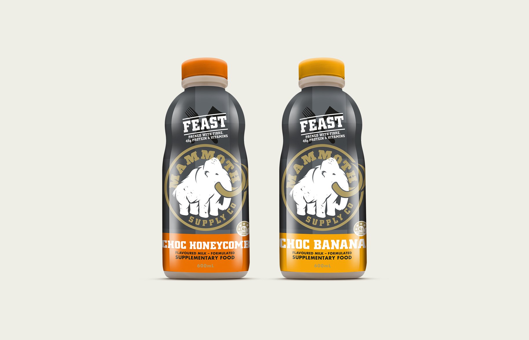
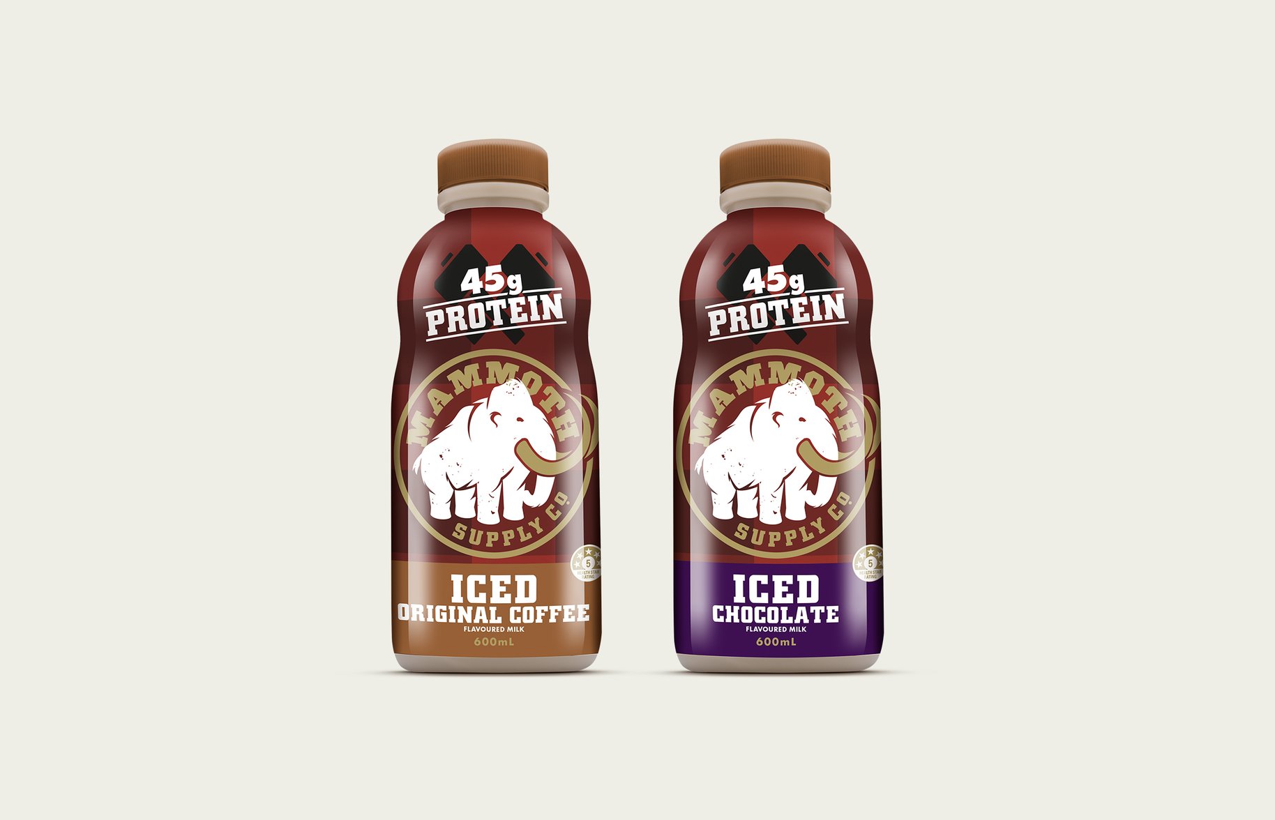
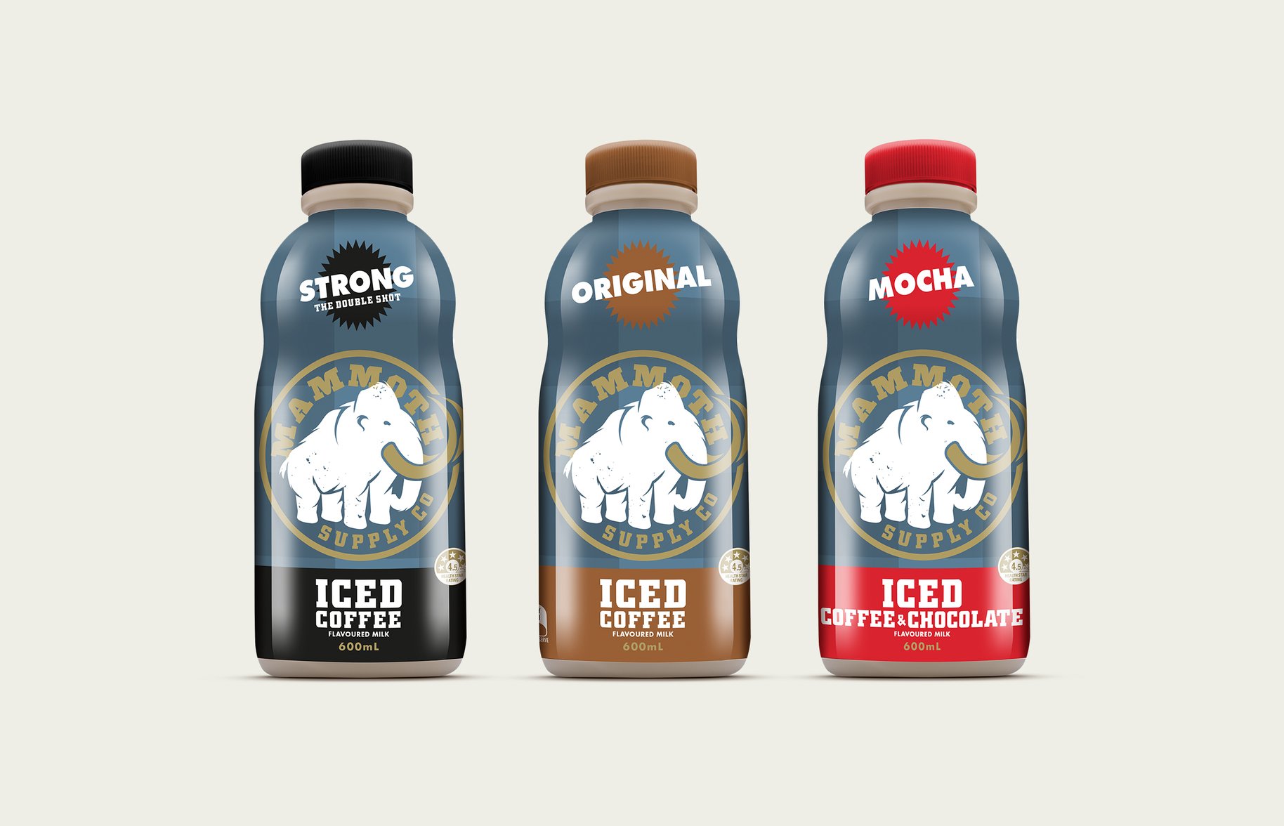
Like its woolly predecessor, Mammoth the brand was sliding towards oblivion when we inherited its makeover. But for us this one had to be a no-brainer. With a name like Mammoth you better walk the talk. So our revitalized logo moved to centre stage. A keen eye will detect the subtle shifts like rotating him a little to the left and opening the legs a little wider to make him look more confident, and full of intent. Intent for greater brand awareness. Throw in a better information hierarchy and Mammoth is now recognisable a mile off. Monumental and legendary.
- •
- •
- •
- •